Utility
Utility measures the performance of a downstream model or algorithm when run on the source data versus the synthetic.
Generally, synthetic data shows a drop in utility compared to the source. This is not always the case: sometimes the synthetic data can randomly increase utility by chance. Generally, the aim of smart synthetic data generation is to minimise loss in utility.
Currently, Hazy only measures utility for predictive analytics use-cases. For clustering and other unsupervised learning techniques, you can use similarity as a proxy for utility and/or perform your own bespoke evaluation.
Predictive utility
This reproduces a Machine Learning task of predicting a given target column, given a set of columns to predict and an algorithm to use for each column (Classifiers for categorical columns and regressors for numerical columns). In order to evaluate the quality of the results fairly, a test dataset subset is held back from the synthetic data generator during training and used as final evaluation dataset.
NB: All three datasets (source, synth and test) are normalised by rescaling all numerical data to 0-1. Null values in numerical columns are stored as a separate boolean flags and resampled in the column. Categorical columns are transformed by applying an ordinal encoding.
Use cases
This metric is recommended for Machine-Learning / predictive oriented use cases where one or more columns within the dataset are used as the target for either a regression or classification task.
Interpretation
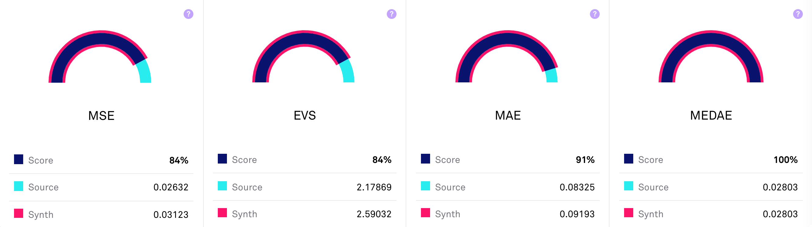
The final predictive utility score is an average of the scores for each of the performance metrics (across all target columns, in cases where there is more than one). It is noteworthy that the synthetic score can also show an improvement over the real data.
NB: The scores show-cased are different for regression and classification tasks.
| Quality interpretation guide | ||||
|---|---|---|---|---|
| 0% – 30% | 30% – 60% | 60% – 80% | 80% – 90% | 90% – 100% |
|
|
|
|
|
|
Troubleshooting
If this metric shows poor results for one or several columns, you can try to improve the results by doing one or several of the following:
- Increase n_bins
- Increase max_cat
- Increase sample_parents
- Increase n_parents
- Increase epsilon or set to null [! privacy risk]
- Increase n_bins
- Increase max_cat
- Increase n_parents
- Increase sample_parents
- Set sort_visit to
true - If an interpretable model is needed, use one of the following:
LogisticRegression,LinearRegression,LGBM,DecisionTree,RandomForest
This metric requires both a target column (label_columns) and a machine learning model (predictors) to be specified when training. The model can be a classifier or regressor from the list below:
naive bayes gauss- Naive Bayes Classifierlogistic regression- Logistic Regression Classifierk-nearest neighbors- K-Nearest Neighbours Classifier or Regressordecision tree- Decision Tree Classifier or Regressorrandom forest- Random Forest Classifier or RegressorLGBM- Light GBM Classifier or Regressorlinear SVM- Linear Support Vector Machine ClassifierSVM- Support Vector Machine Classifier using the Radial Basis Function (RBF) kernellinear- Linear Regressorridge- Ridge Regressor
This metric comes with the option to disabled predictor optimisation, by default this is enabled. All models are optimised using a Bayesian optimisation method. Some of these methods are faster and more precise than others. Logistic Regression lgr and Decision Trees decision_tree are among the fastest to run. Light GBM lgbm can be slow to run, especially when classifying a column of high cardinality. Note: Some do not support feature importance.
Feature importance shift
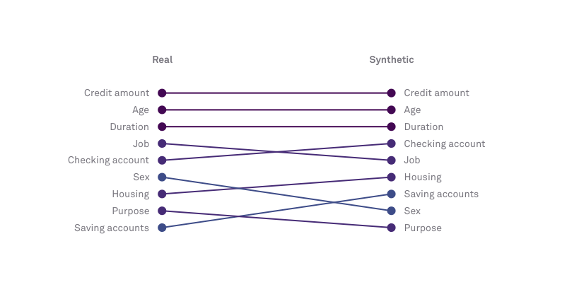
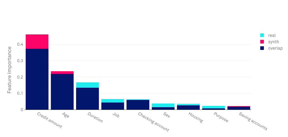
This metric compares the order of feature importance in the model trained on the original data and the model trained on the synthetic data. Most machine learning algorithms can rank the variables in that data by how informative they are for a specific task.
When using an algorithm that allows for the computation of feature importance (RandomForest, LGBM, DecisionTree, etc) a feature importance score is computed by averaging the histogram similarity between the feature importance bar charts of the source and synthetic data with the feature importance order/sequence similarity which is computed using the Levenshtein distance.
Synthetic data of good quality should be able to preserve the variables’ order of importance. In the example below, we see that within the Hazy UI you can see the level of importance set by the algorithm and how accurately the synthetic data retains that order.
Troubleshooting
Confusion matrix
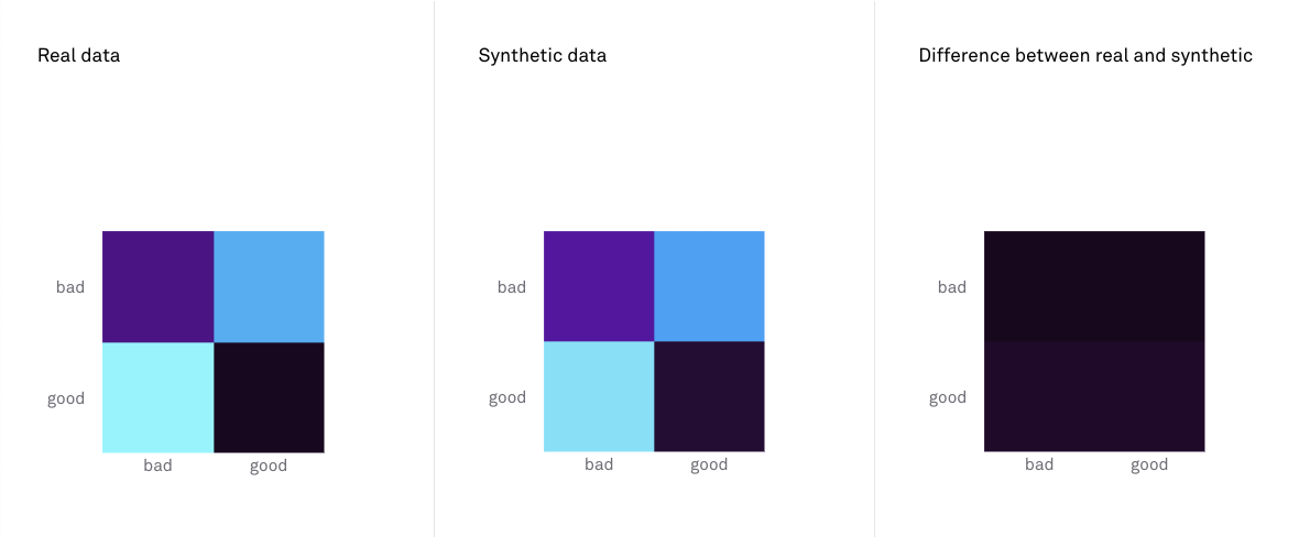
Confusion matrices illustrate how many true positives, false positives, true negatives and false negatives are made when predicting categorical target variables. Confusion matrix shift illustrates the difference between a confusion matrix produced by a predictive model trained on the synthetic data and that of a model trained on the real data. Darker squares are a sign of higher performance.
Troubleshooting
Agreement rate
Agreement rate is the frequency with which a predictive model trained on the synthetic data and a predictive model trained on the real data make similar predictions.
Query utility
The intent of the Query Utility is two-fold. Firstly, it estimates how useful the synthetic data for a use-case in which the end-user relies on the generated data for data analysis work by running a set of queries against it. Secondly, it is an attempt at ensuring that high-dimensional joint distributions (of 5 to 10 columns) are preserved accordingly. Given that checking very high dimensional joint distributions can easily become an intractable problem, a sampling approach has been introduced.
This metric works by randomly selecting up to 1000 unique combinations of 1 to 5 columns for which the joint distribution is then computed as a discretised histogram on both the real and synthetic data. A similarity score is then computed as the sum of the minimum over the sum maximum of two distributions. This leads to a score that is between 0 and 1 for every column combination sampled; it is then averaged overall all sampled combinations to get an overall score.
NB: numerical data is binned in order to allow for a tractable computing of the multi-dimensional histogram
Use cases
Use this metric for more advanced use-cases where cross column statistics and information must be preserved. This metric is especially useful for analytics reporting as this metric simulates the process of running queries against the data and ensuring that the results deduced are similar.
Interpretation
| Quality interpretation guide | ||||
|---|---|---|---|---|
| 0% – 30% | 30% – 60% | 60% – 80% | 80% – 90% | 90% – 100% |
|
|
|
|
|
|
Troubleshooting
If this metric shows poor results for one or several columns, you can try to improve the results by doing one or several of the following:
- Increase n_bins
- Increase max_cat
- Increase n_parents
- Increase sample_parents
- Select a more complex classifier :
DecisionTree,RandomForest,LGBM